

Task: to follow the established art direction and reskin the wireframe provided
Tools I Used: Figma and Photoshop
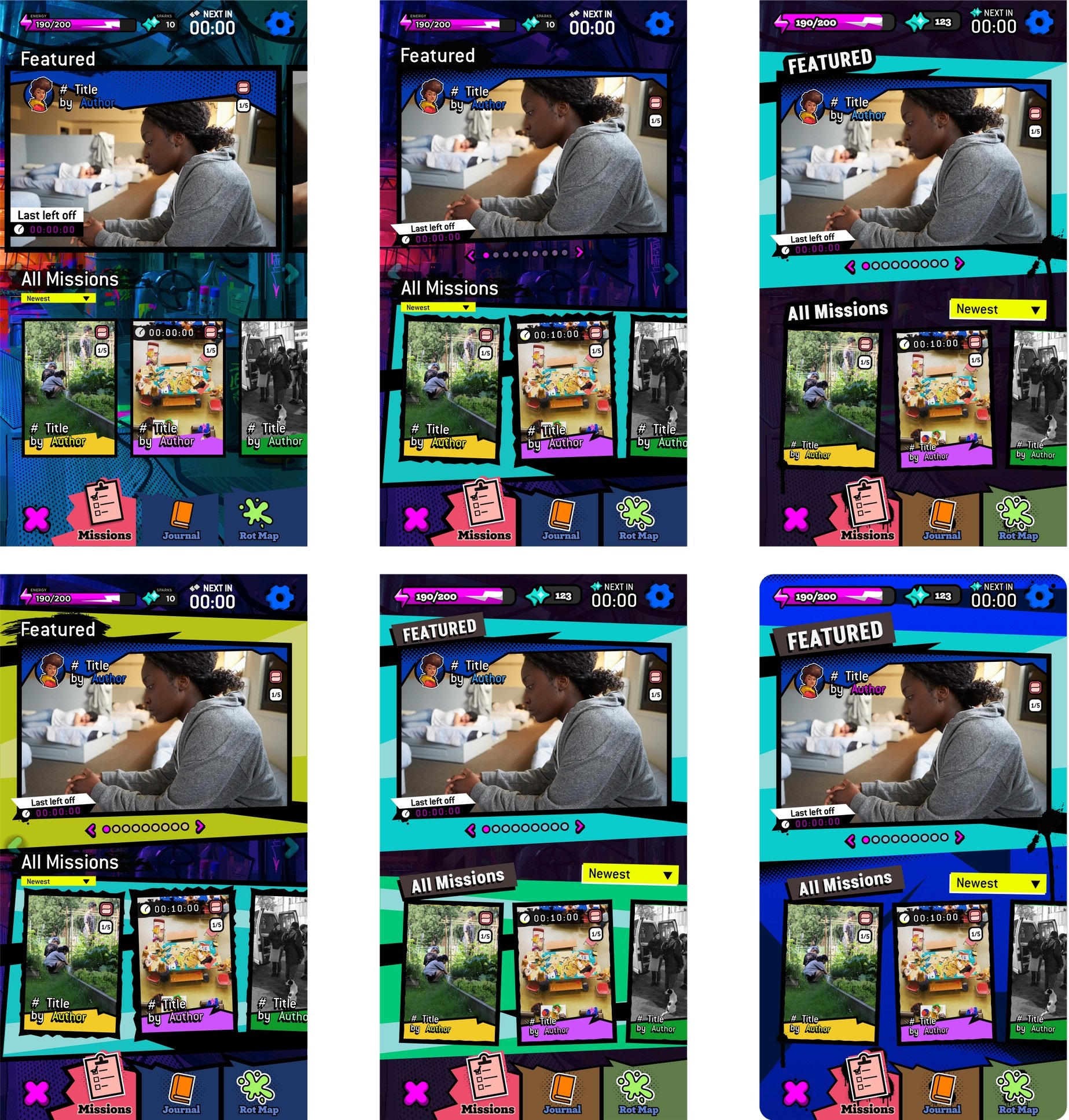
Art Direction to Follow: Persona 5, bold, textured.
What I learned/What I’d do Differently: Overall, I’m really happy with the final outcome. It was my first time working in this style, and I loved it. I learned a lot about how to make the specific icons and their shading that fit with a Persona 5 style. I wish I could have just spent some time on the UX and maybe updated some of the settings and menu icons to be more readable as separate from gameplay (the blue is hard to read in my opinion).
Final Files


Process
Recreate Wifreframe in Figma & Build out Foreground & Background Elements
Make icons from scratch
Iterate on style, background, colour
Find fonts, images, and selection states


I made components in Figma and plugged them into my wireframes and slowly adjusted colours! I also started to update all the icons to bring them to the UI style guide that was provided to me and to push me to get more comfortable with the art style.
It was also important to start experimenting visually! I started to break out the navigation component and experiment with it.


And then I spent some time iterating on slight visual changes to help clear up the page visually.
Some examples of my components page in Figma and my references page! I iterate a lot and very quickly. It was hard to make clean components in such a short timeline, but I did my best.

