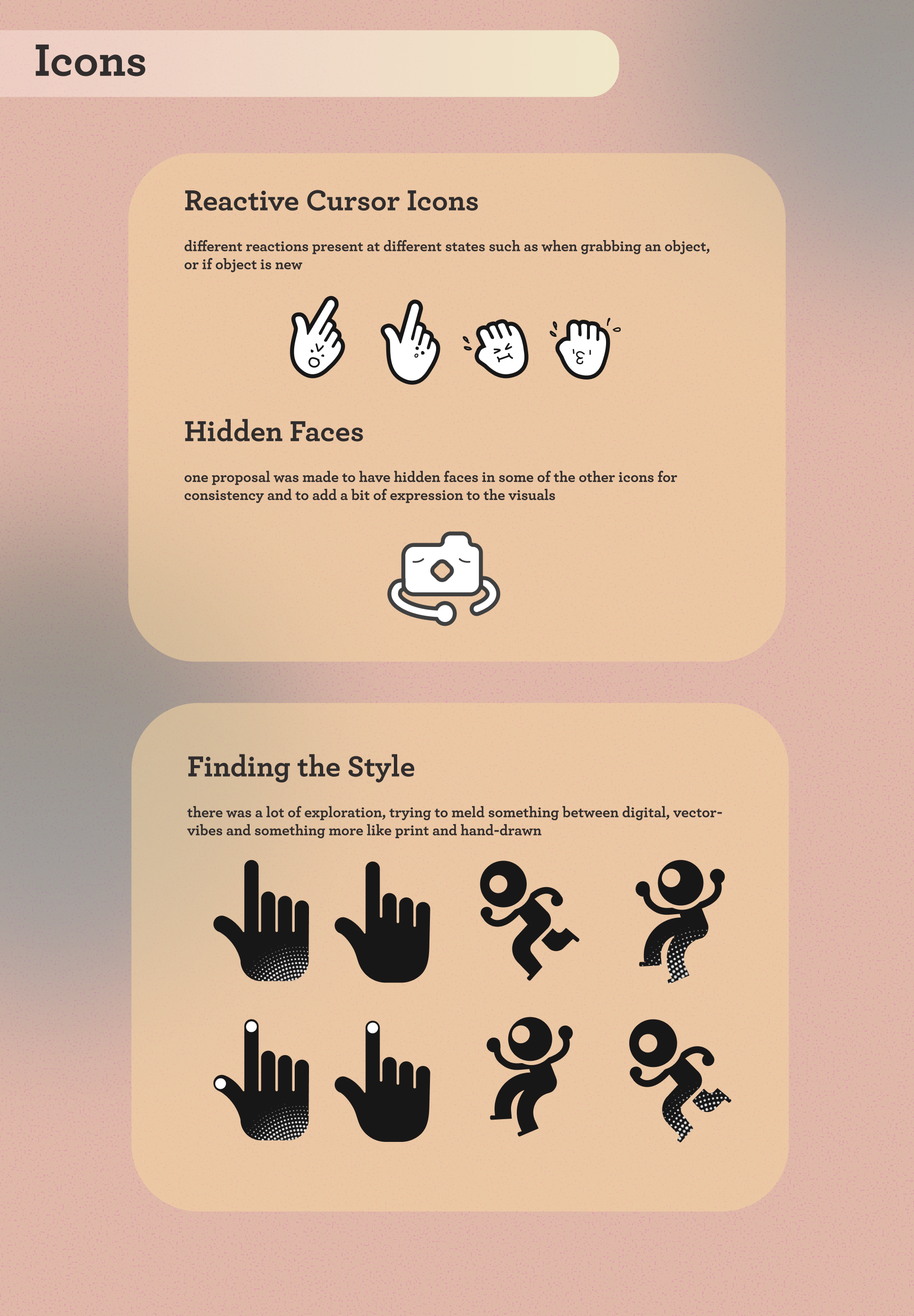
On Young Suns, I worked predominantly on UX. My work spanned everything from broad explorations of the style and icons to proposals for screens and menus and finally to prototypes and animations made in Figma. The mandate for visuals was complex, moving between vector and print-style to hand-drawn and more loose images.
First UX for Decorator System
Style Explorations
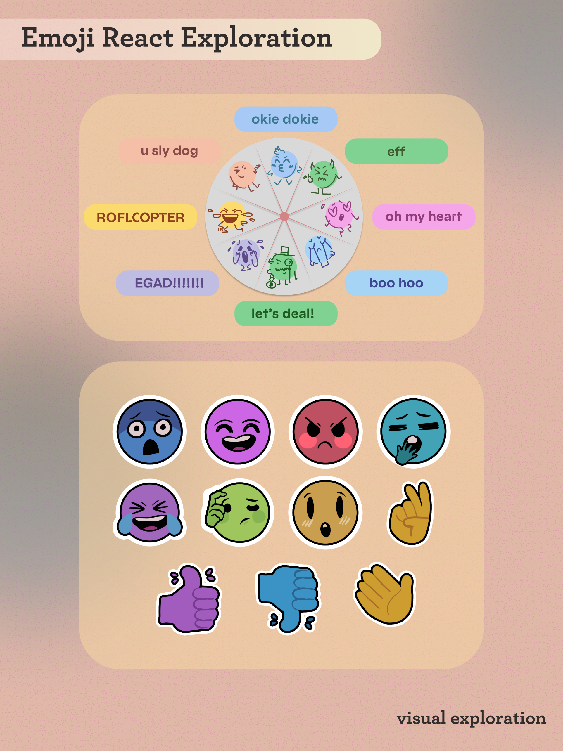
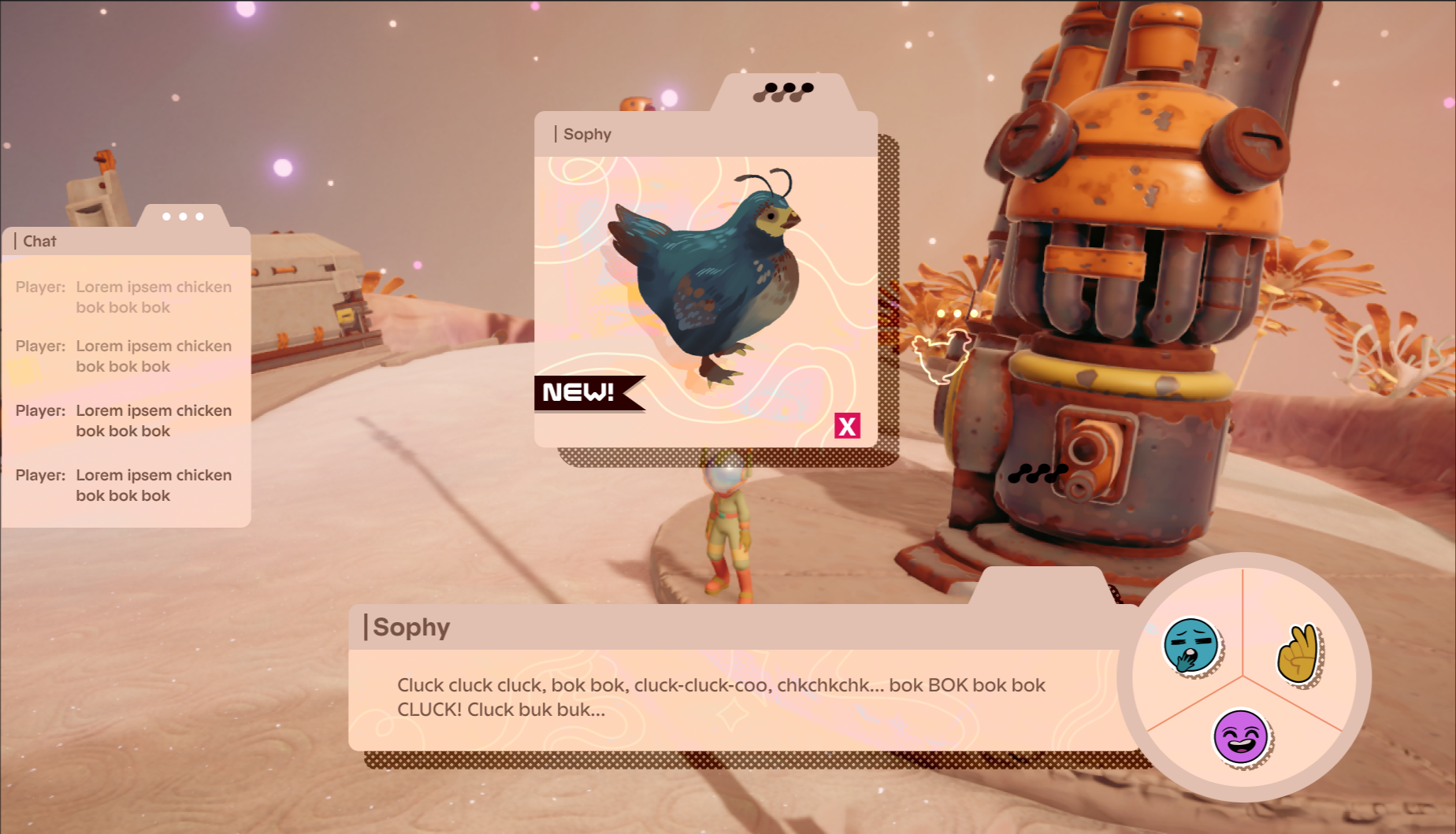
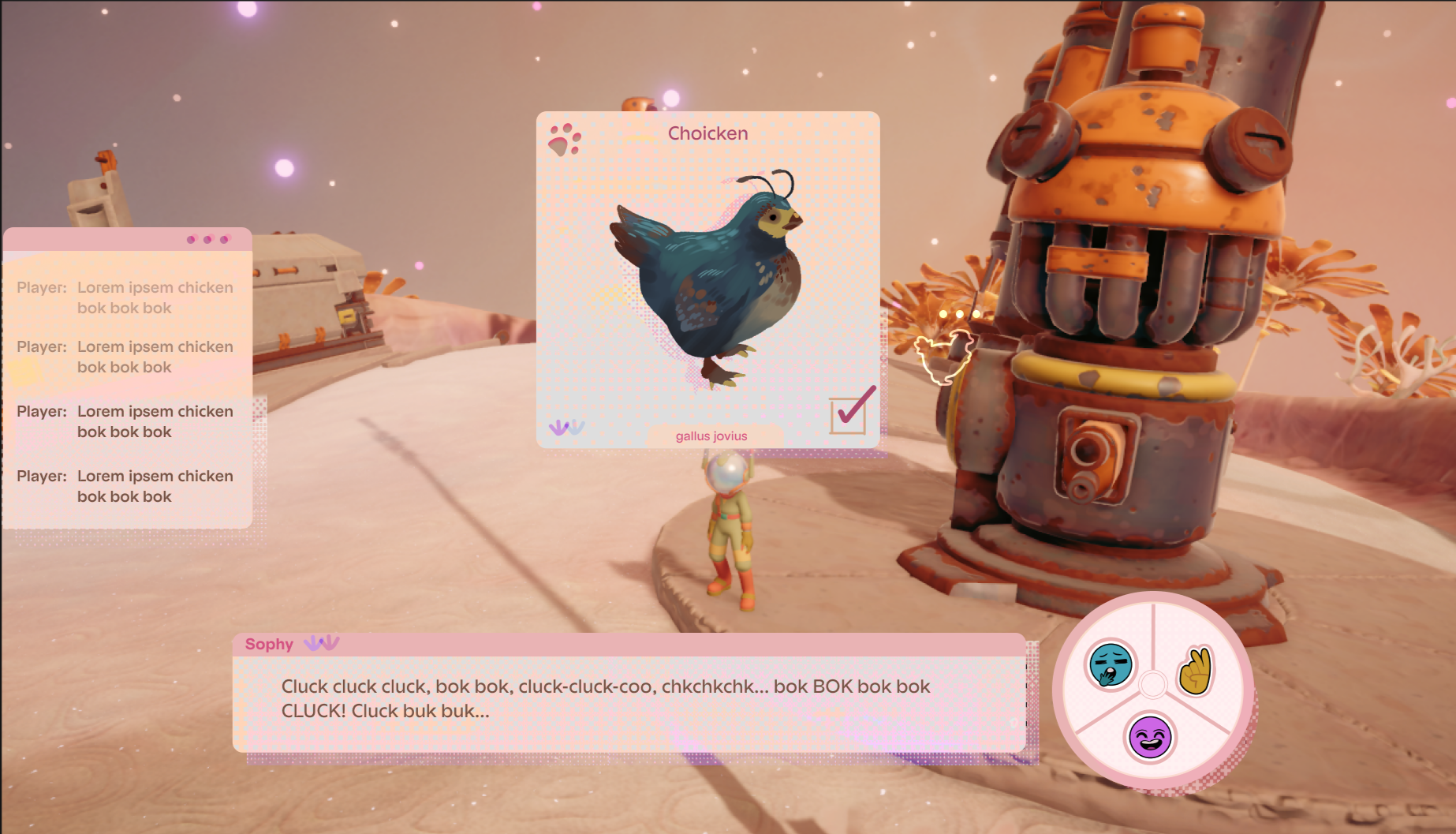
I love to explore as many variations on visuals as I can. I tried to bring together the proposed elements and visual designs from the art director and the team into the explorations for these screens where the player might discover a new animal and even have a conversation with it. In the game, rather than dialogue choices, the emoji wheel gives players an idea of what their responses to NPC’s convey with a certain amount of fluidity.
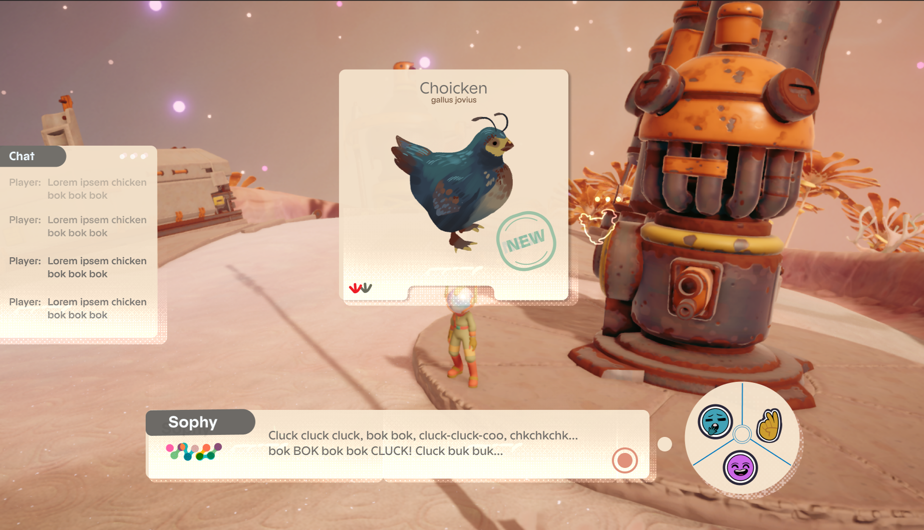
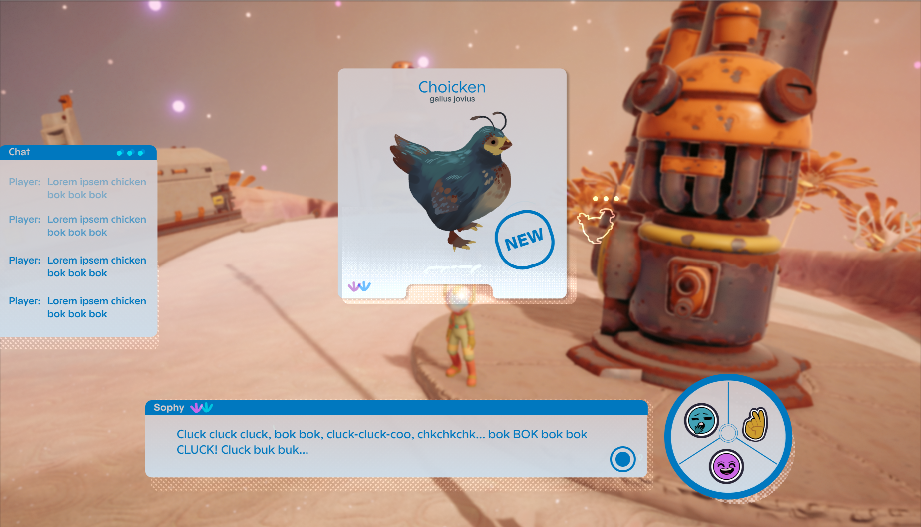
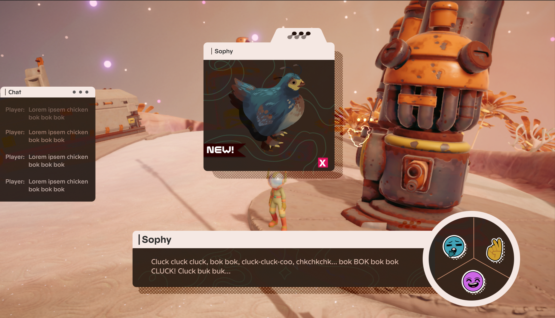
Chicken..Post-its?
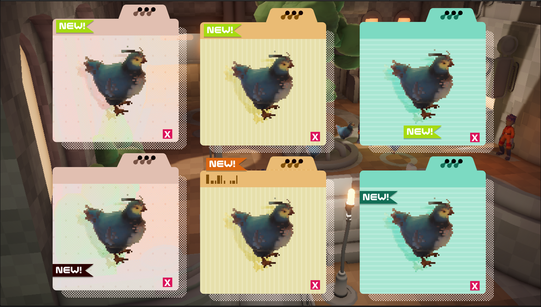
Discovering new creatures felt like a great way to play with the style and playfulness of the UI. The images below show some of my early explorations of what the chicken discovery coud look like.
Early Mockup for Maps
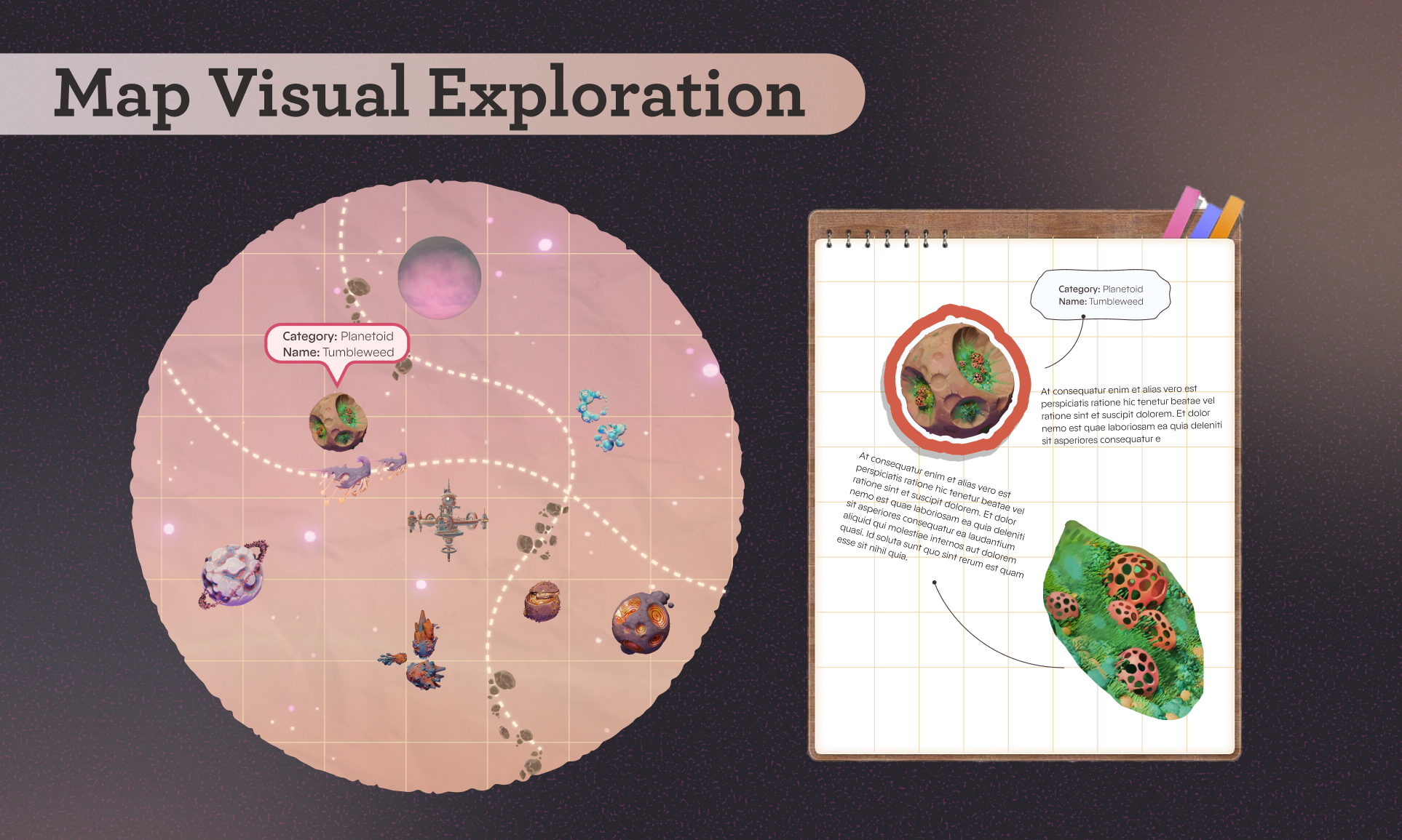
I wanted to present a brochure approach to the map, something that felt a bit fun and organic
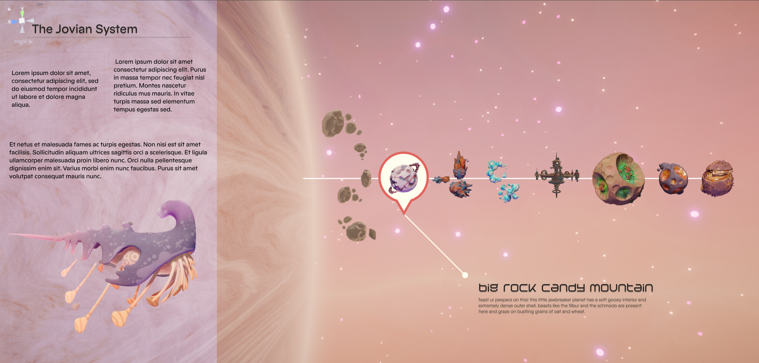
Outside of the larger brochure-style map, I wanted to explore something that felt like you were looking through a periscope or a lens. The player would have their map and upon selecting a location, they could choose a planet to read more about.
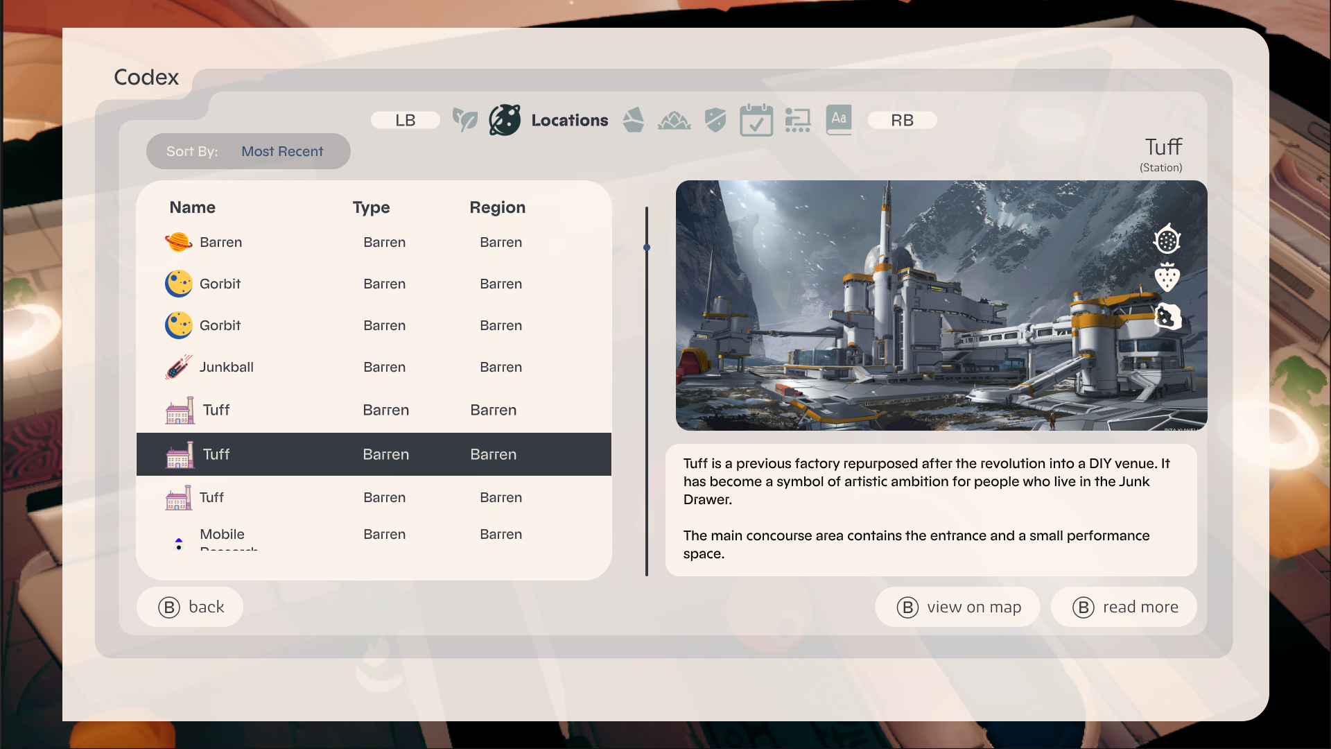
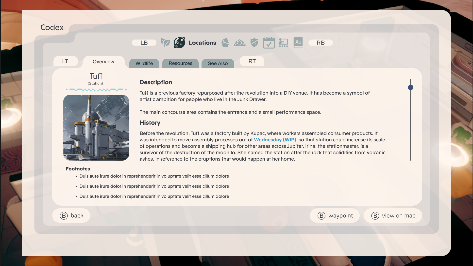
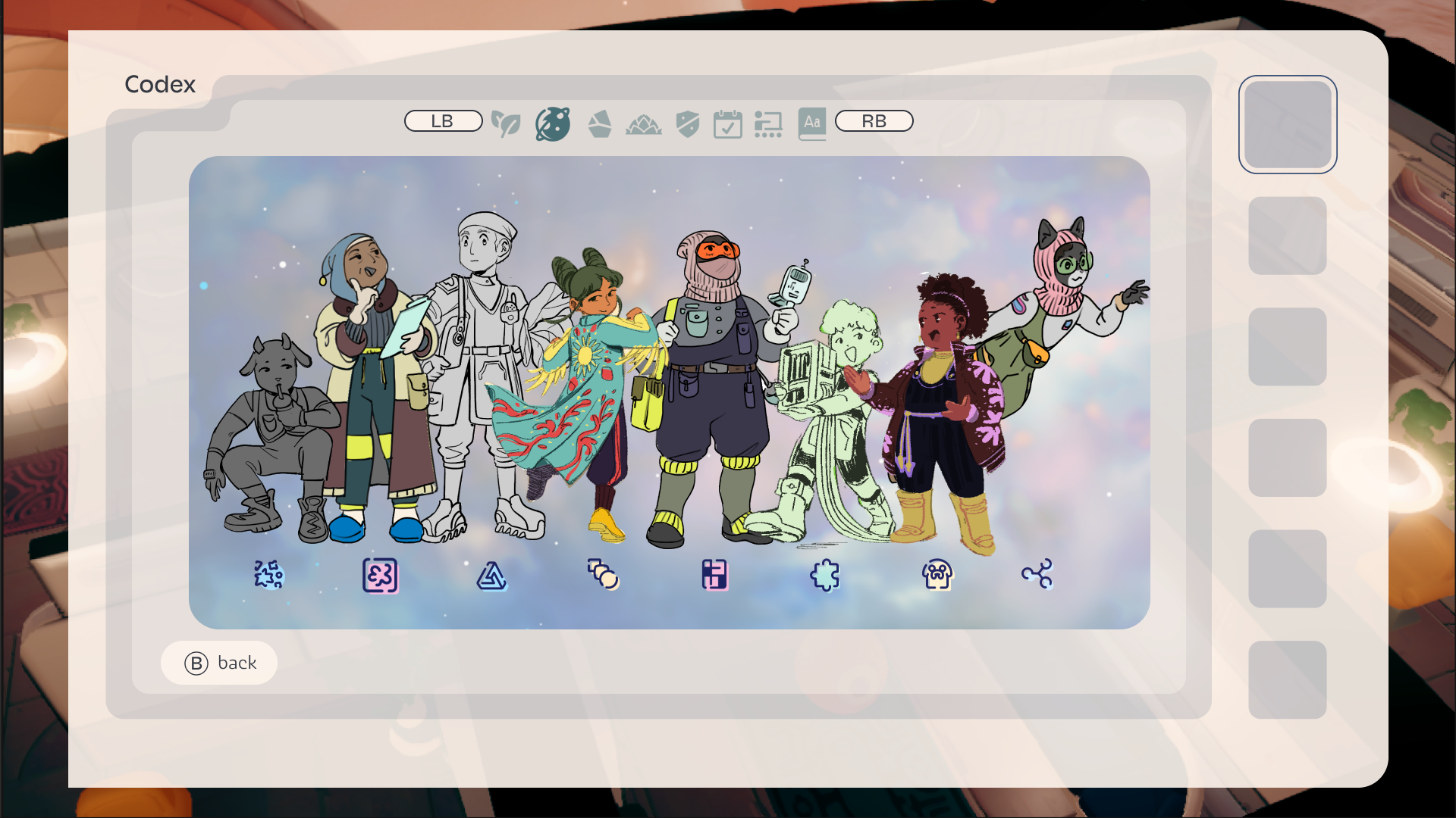
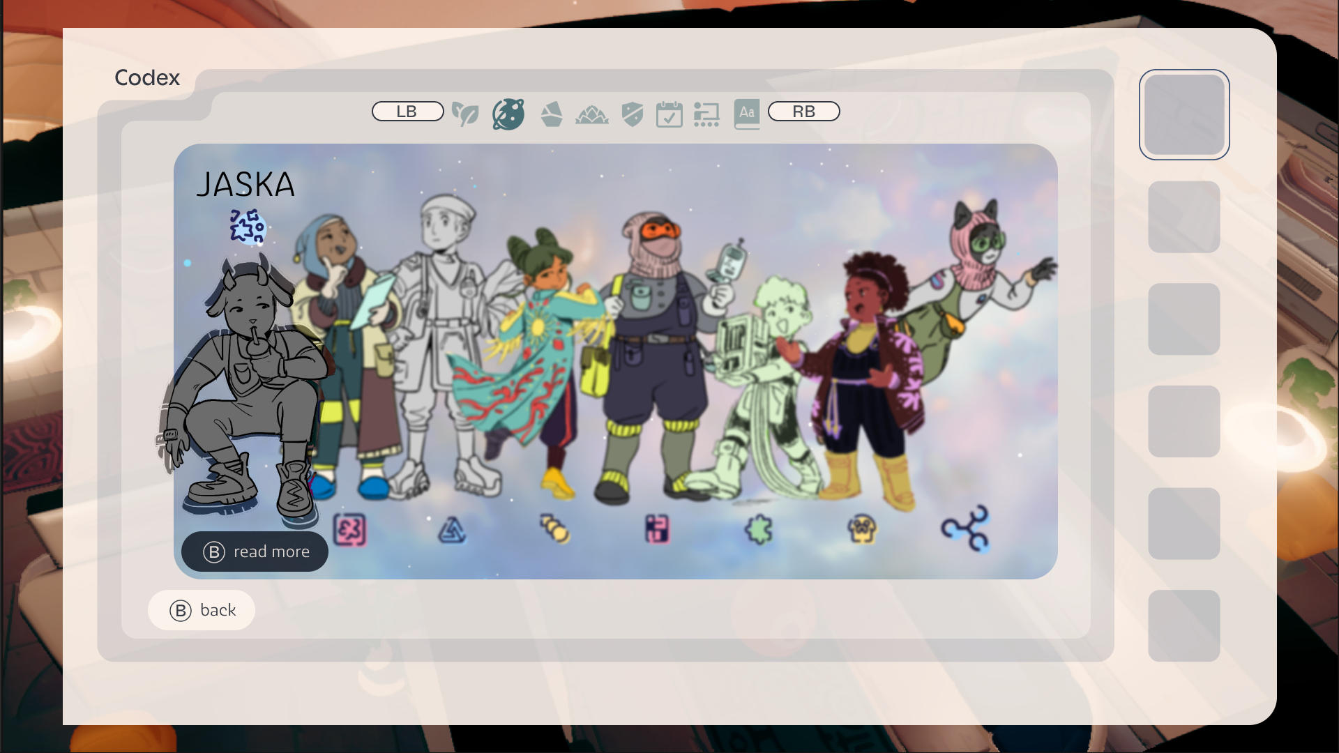
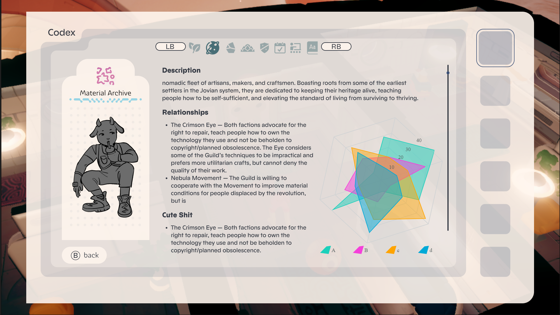
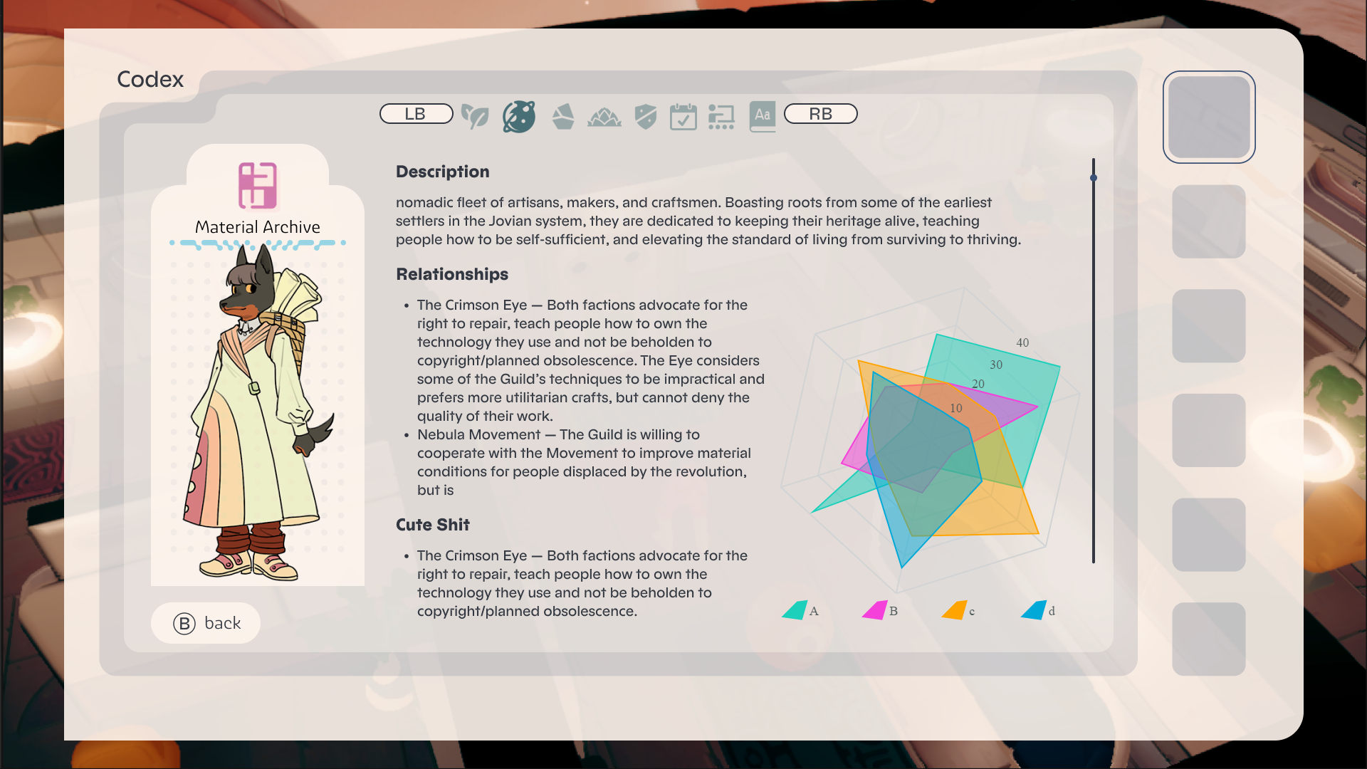
Codex: Locations UX
The Codex is a space to read more about everything from fauna to specific locations. The Locations UX below is split into 2 screens to show you the higher level view and what happens when players click to read more.
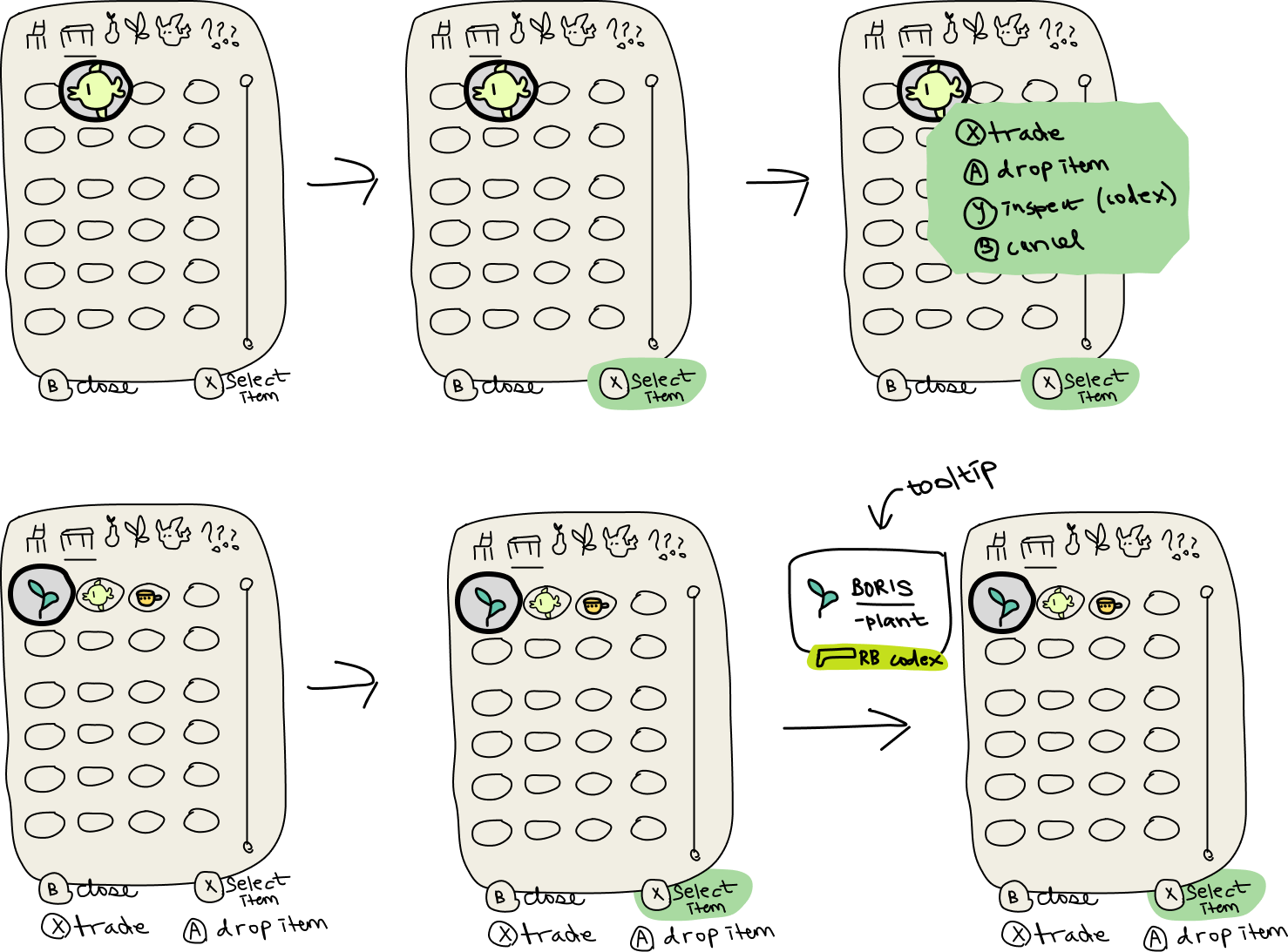
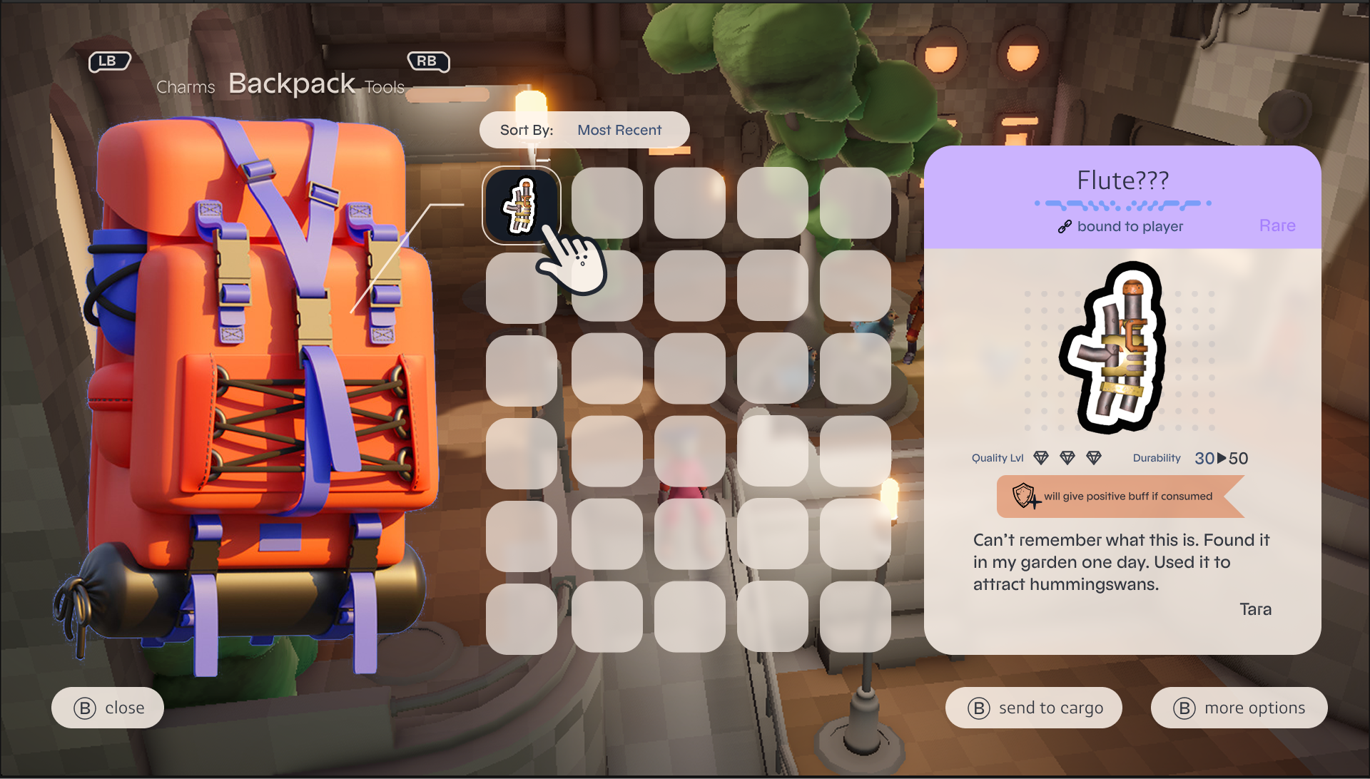
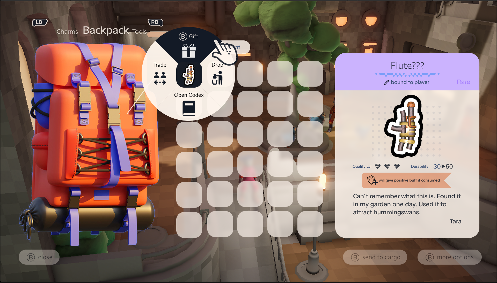
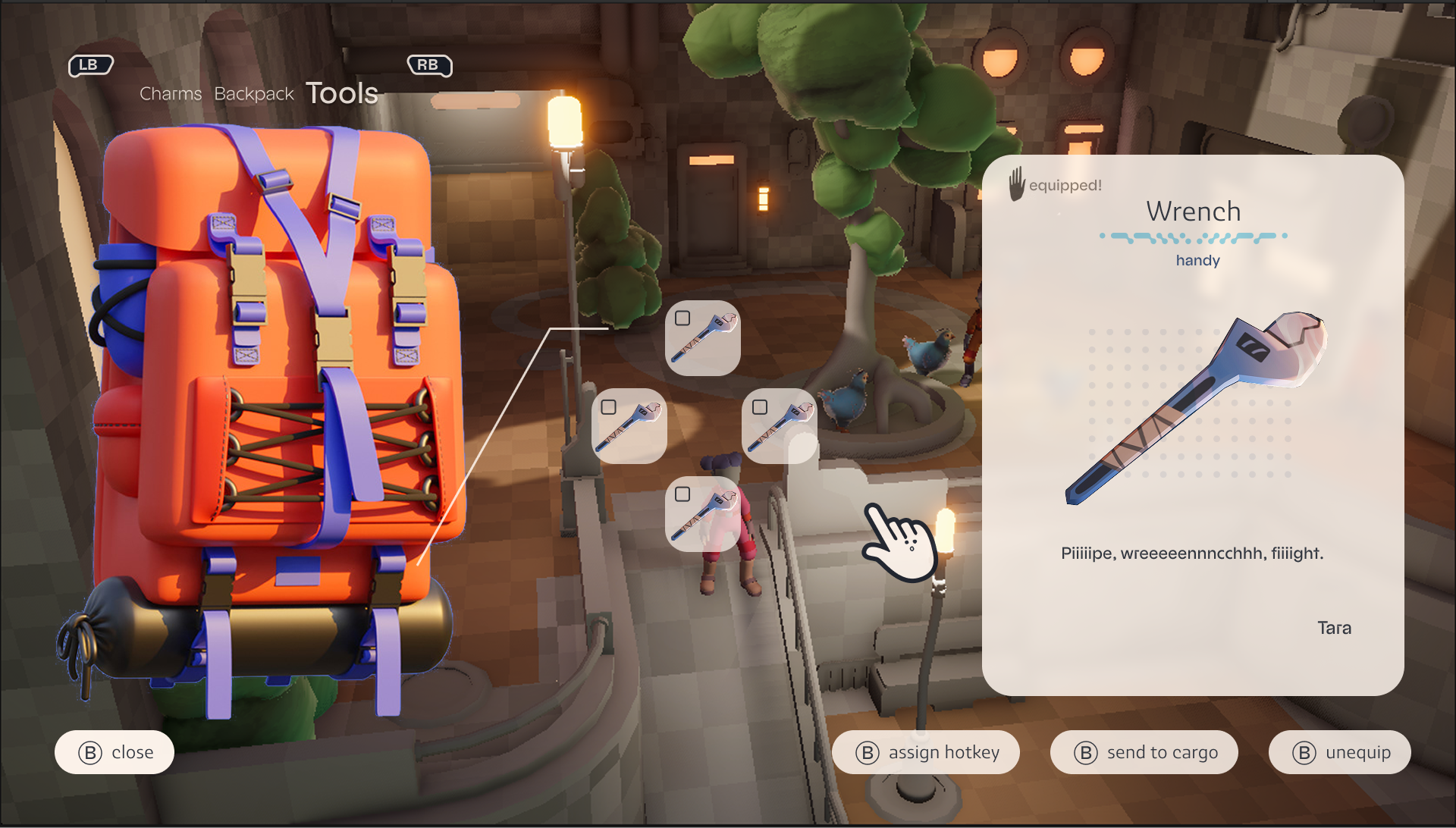
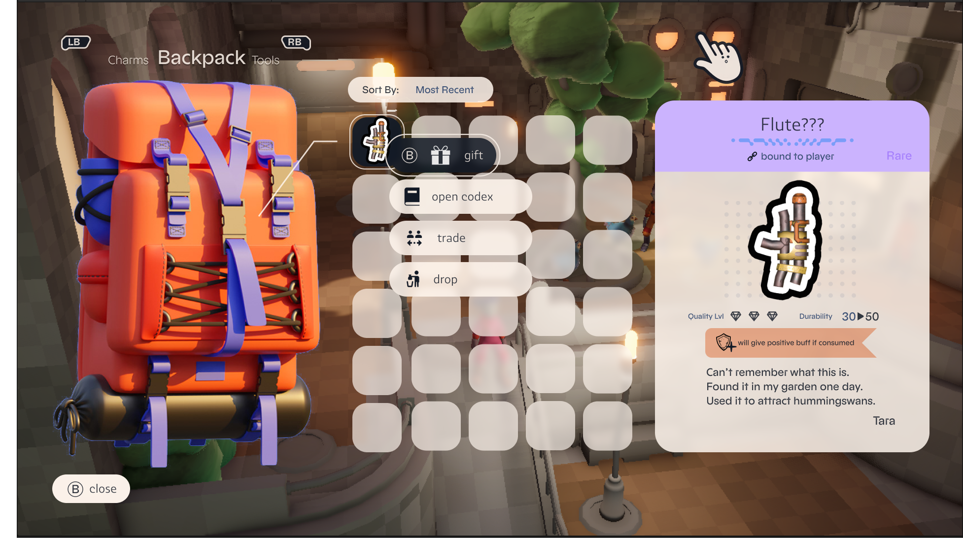
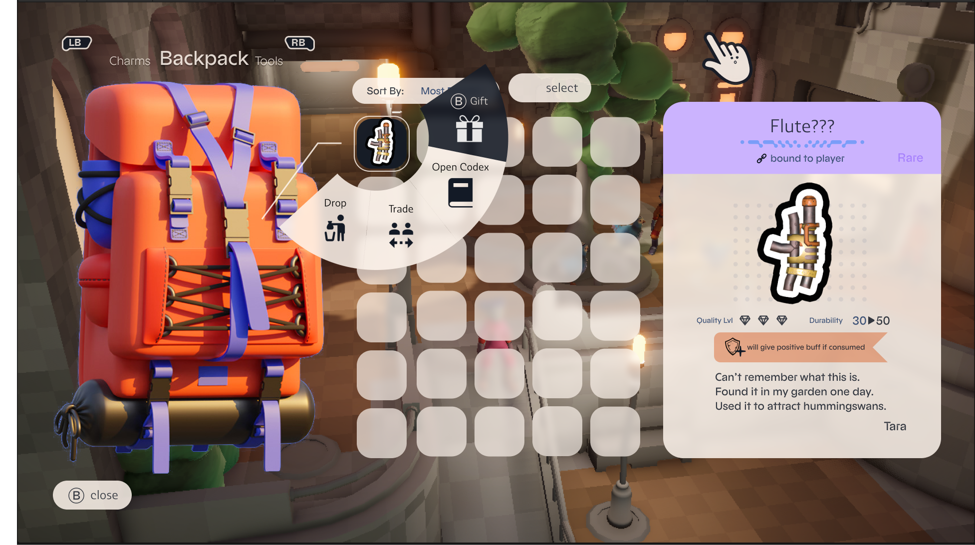
Backpack UX
The backpack UX below shows the intention behind three separate parts of the backpack — the Charms, the Backpack, and Tools that would hang off the pack. Scroll through to see each screen. The last three screens also show the different proposals for a radio or sub-menu when looking at each item in the backpack.
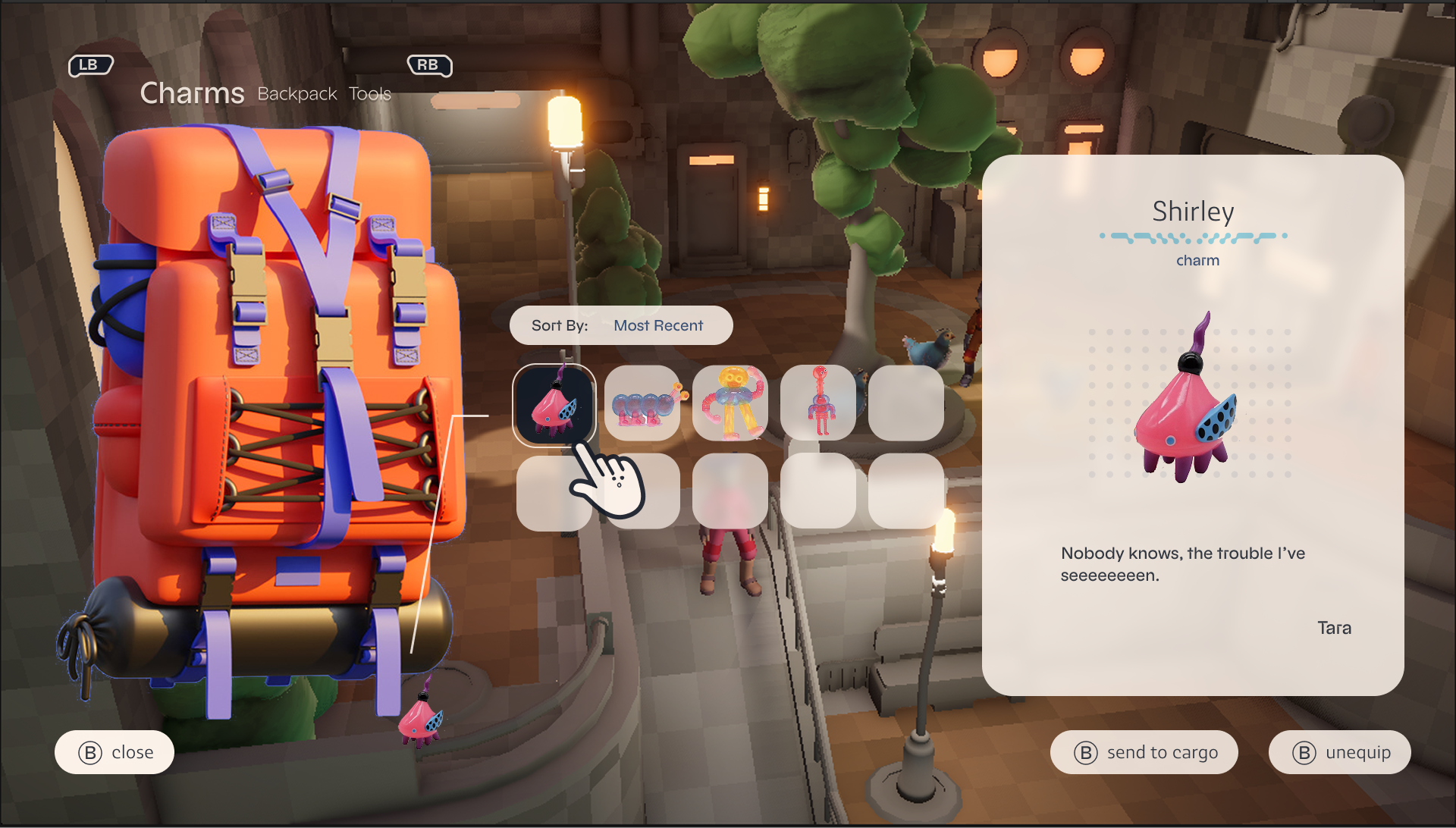
The video below shows my proposal for the navigation and general selection behaviour of the backpack items (made in Figma).
Animated Prototype for Quest Log
Design suggested a radial menu for quests. I split the Codex page dedicated to the Quests into two - the radial menu which features the memento/object that gives the quest and the explicit non-interactive quest data on the right.
Choosing a Faction to Focus On - UX
In the animated prototype below, you can see my suggestion for how to select a faction to focus on and read more about. The goal was to present the factions as equals rather than highlight one group or another as being more powerful or evil etc.
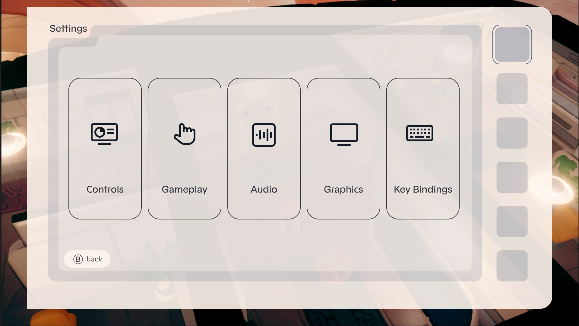
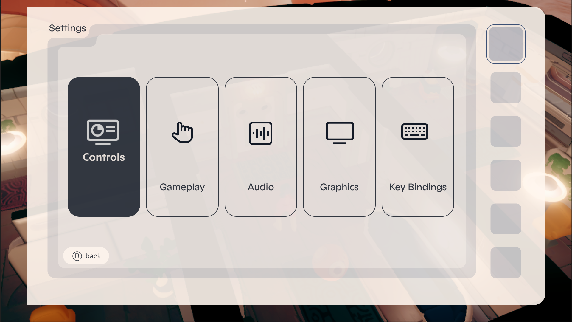
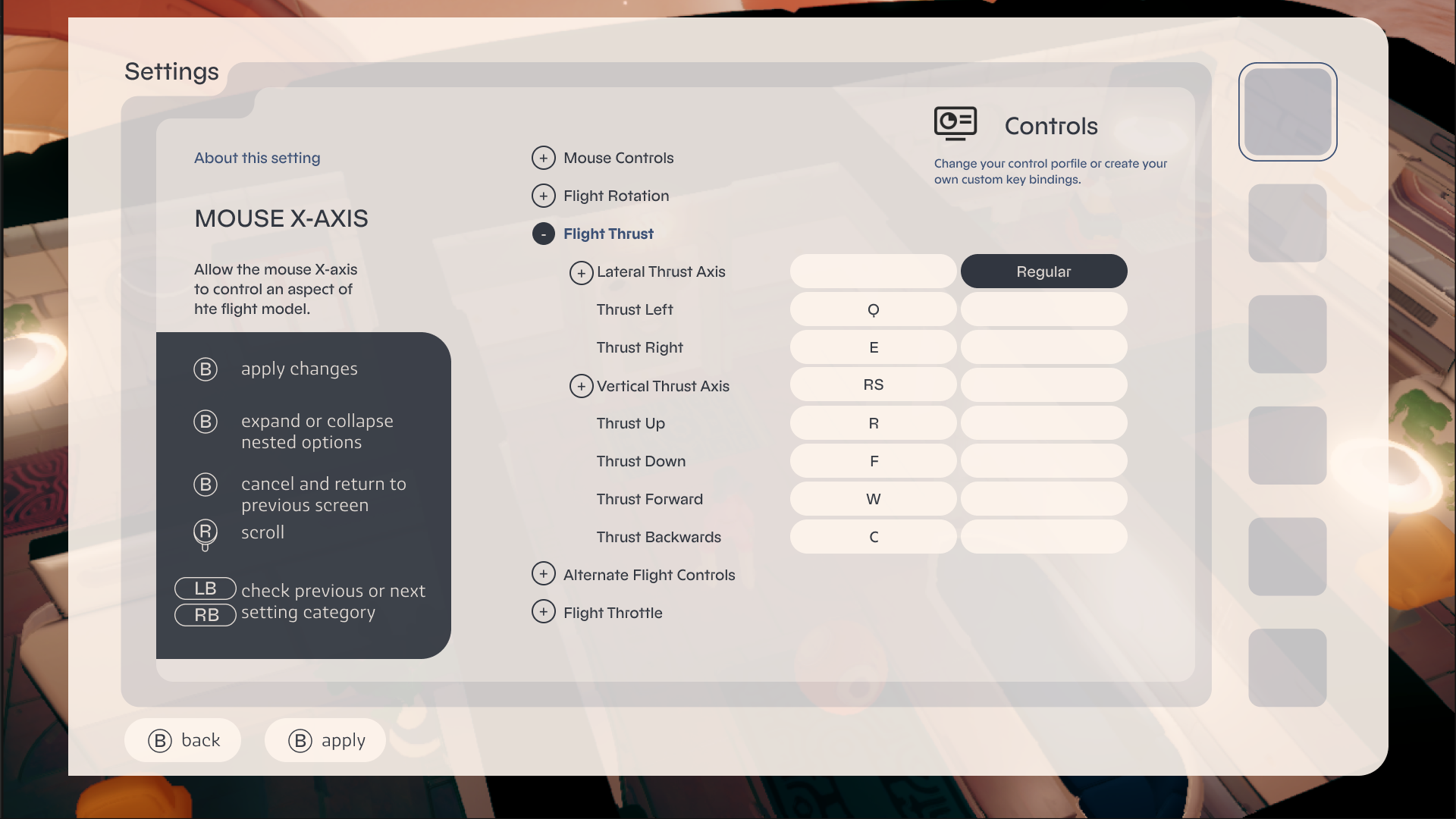
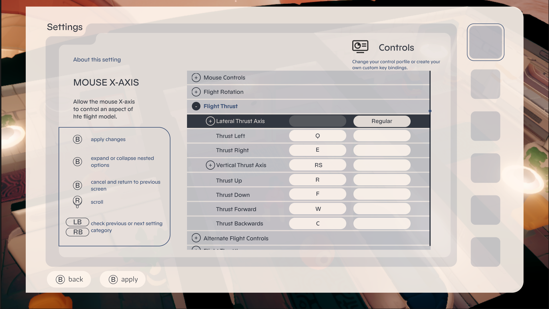
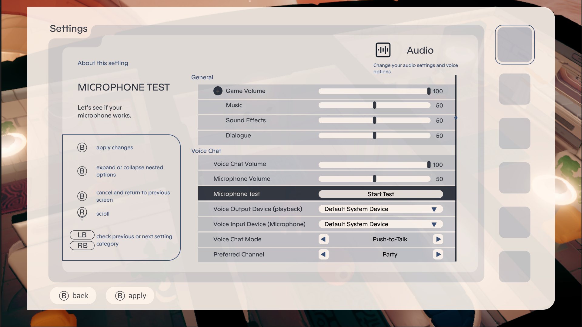
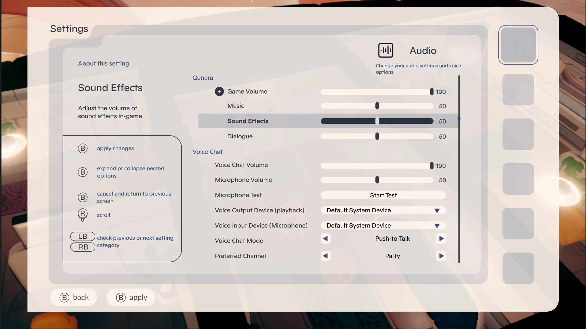
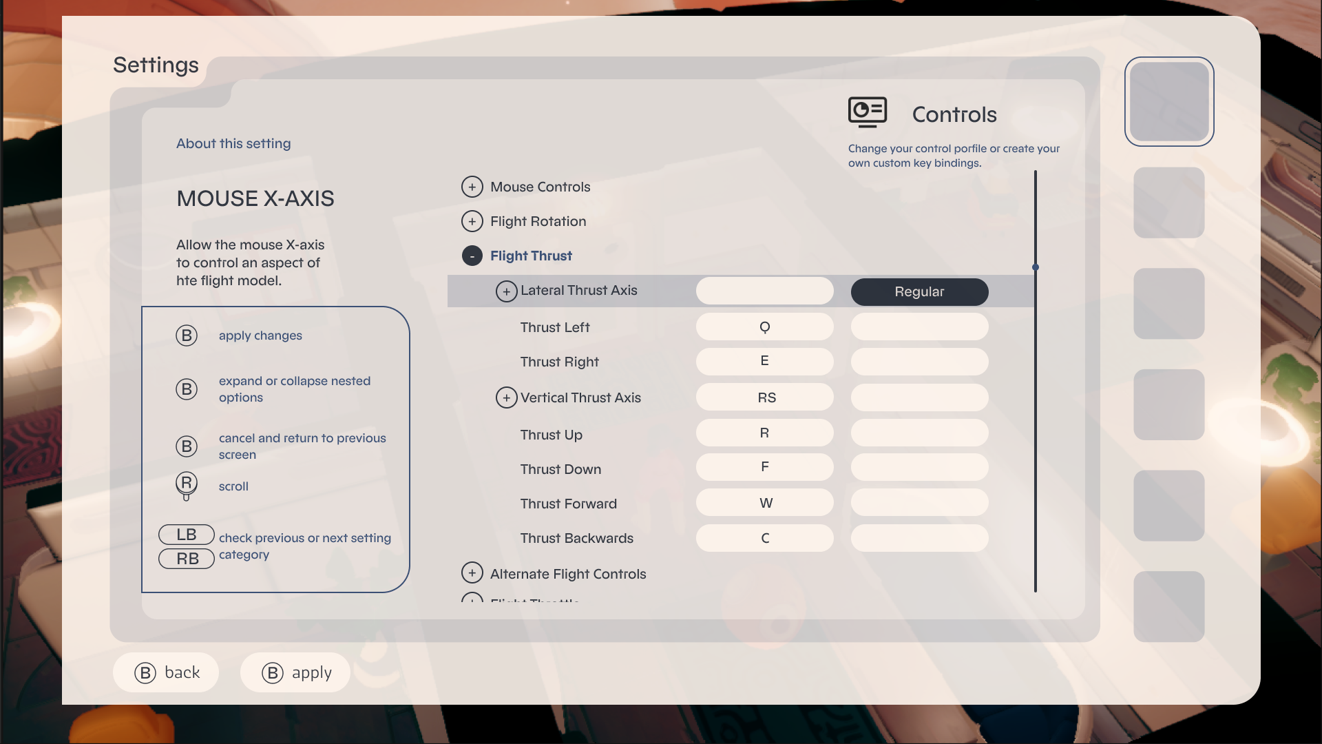
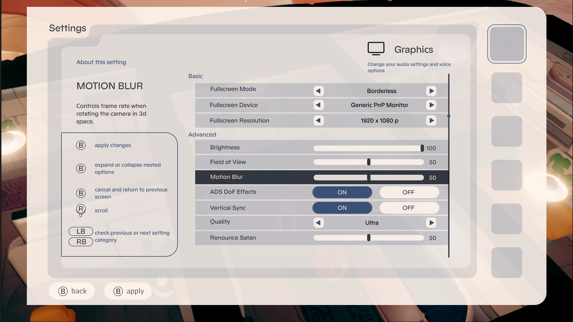
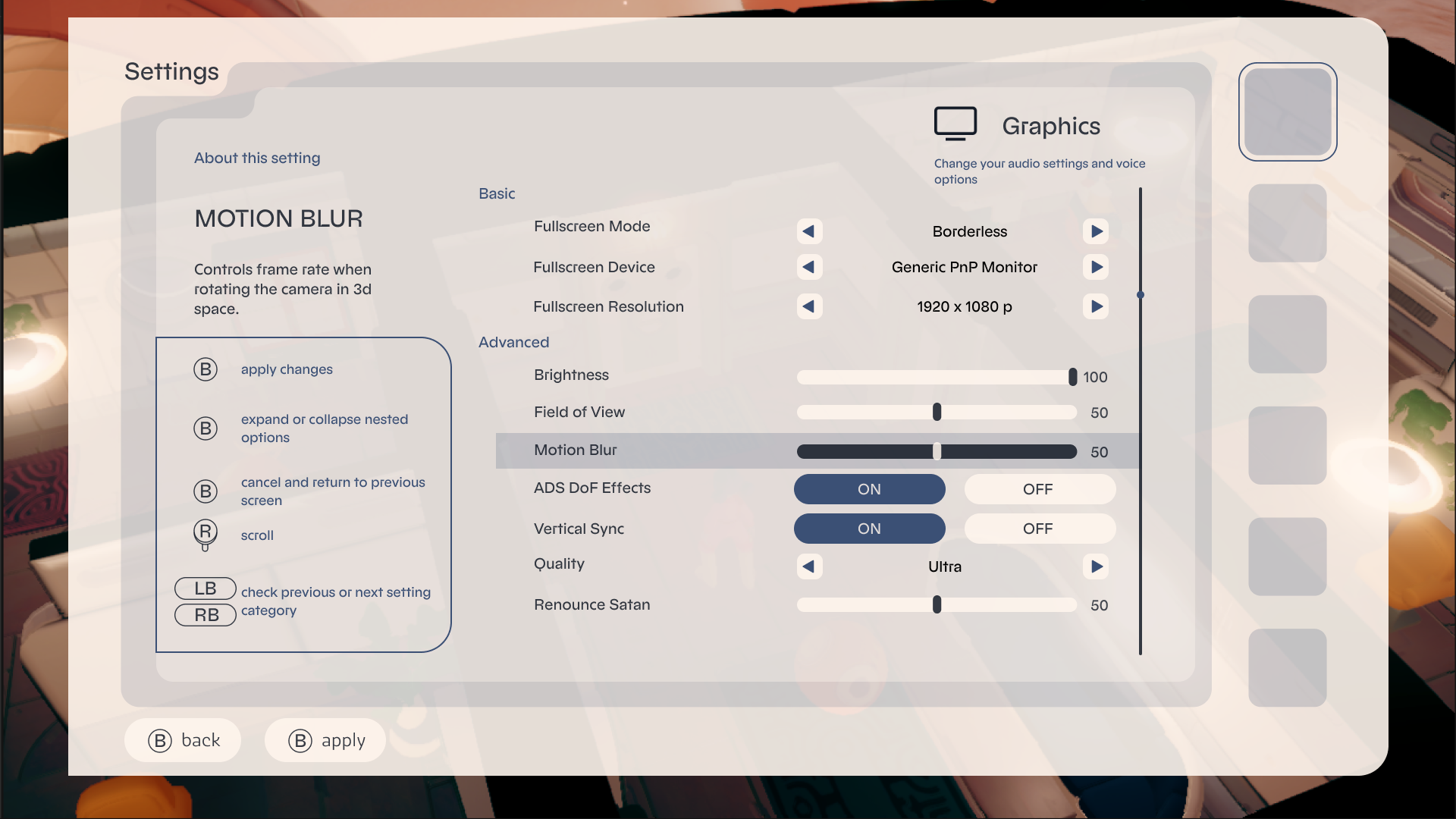
Settings UX
Knick-Knacks
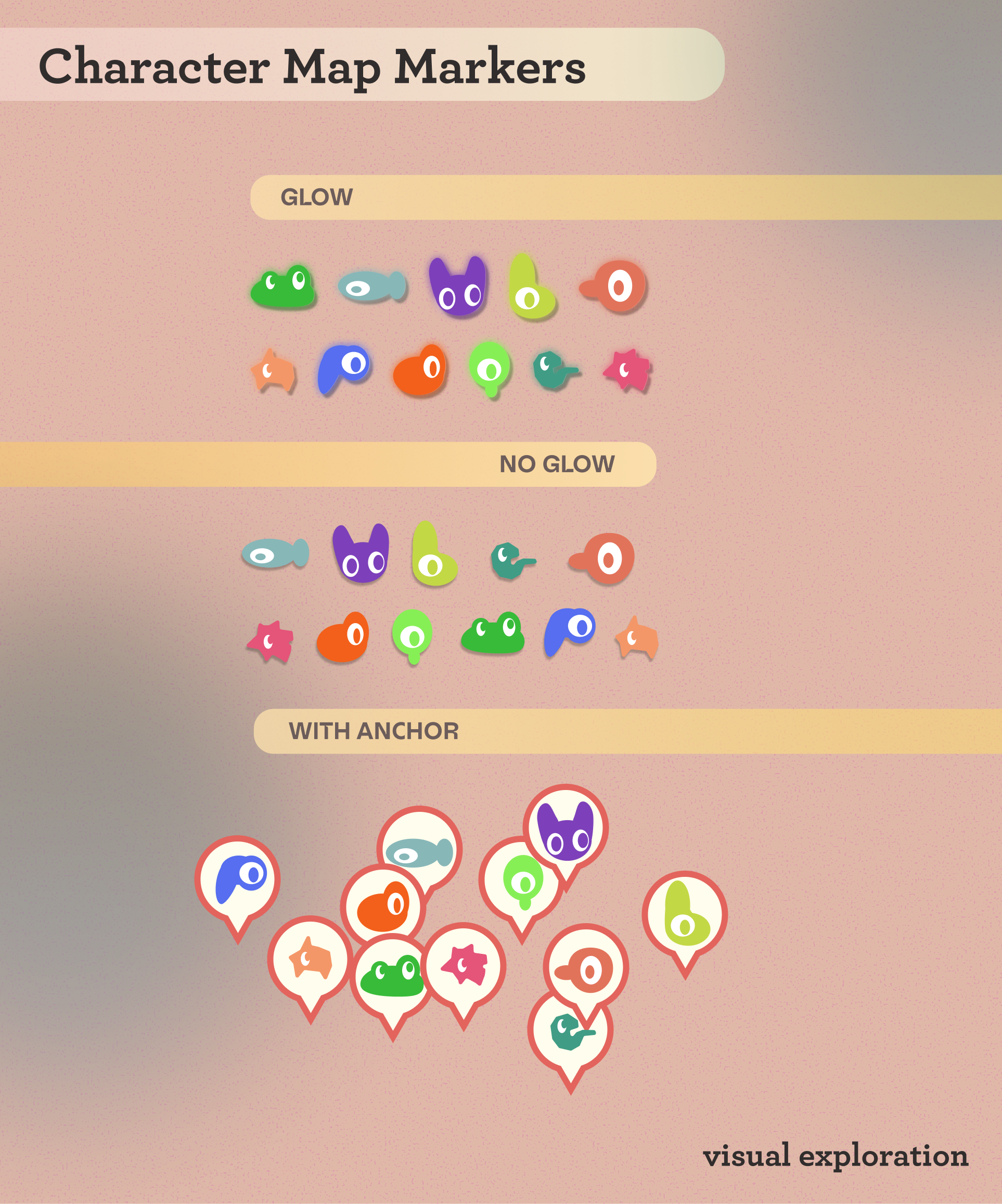
Early ideas for player markers in the world and on the minimap as well as accelerator visuals for the HUD.